TQIP’s Risk-Adjusted Boxplots
Intro
U.S. trauma centers are required to “use a risk-adjusted benchmarking system to measure performance and outcomes.”1 This is most commonly done by submitting registry data to the Trauma Quality Improvement Program (TQIP). TQIP used to provide caterpillar plots to help visualize how each center performed compared to other centers. However, caterpillar plots aren’t particularly helpful for showing how one specific center did compared to other centers (the whole point of benchmarking); they are better suited for showing the overall pattern/distribution of performance.
Therefore, TQIP moved to using “modified boxplots” to better highlight the performance of the center in the benchmark report. I really like these boxplots. They pack a lot of information into a single figure, and that’s what good data visualization is all about. However, they are also really confusing for a lot of people because they are so information dense.
To TQIP’s credit, they (and many others) have created numerous publications and presentations trying to explain their boxplots, but there is still a lot of confusion out their. So here is the inaugural post on the Trauma Data Blog: my attempt to explain TQIP’s risk-adjusted boxplots.
Odds ratios
When TQIP does its benchmark reports, it calculates risk-adjusted odds
ratios as its primary method of conveying your center’s performance.
You can think of these odds ratios as the ratio of the number of events
that were observed in the data (that is, the actual
number of deaths) relative to the number of events that would be
expected or predicted to occur at an average TQIP
hospital. (The technical interpretation is a bit more complicated than
that, but that description is good enough for this post.) That’s why
these odds ratios are sometimes called O to
E ratios.
Odds ratios greater than one (>1) are unfavorable because they indicate there were more events at your center than TQIP’s models predicted based on the data. Similarly, odds ratios less than one (<1) are good because they indicate there were fewer events at your center than predicted. Finally, an odds ratio of one means there were exactly the same number of observed events as there were predicted events.
So, an odds ratio of 1.5 would mean that the odds of the event (whatever it is) were 50% higher (1.5 - 1.0 = 0.5 → 50%) at your center than expected based on the data. But, an odds ratio of 0.75 would mean that the odds of the event were 25% lower (1.0 - 0.75 = 0.25 → 25%) than expected at your center given the data.
Setting the scene
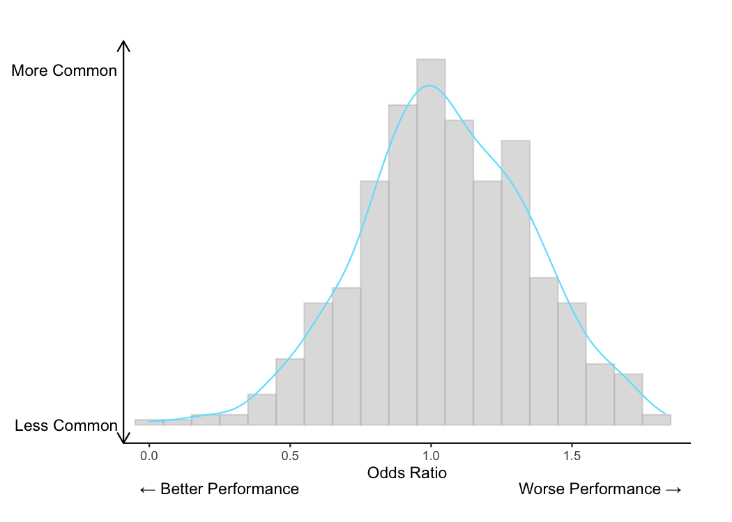
After TQIP calculates each hospital’s odds ratio for a given outcome, the distribution of all those odds ratios will (usually) look like a bell curve or a normal curve. Using some simulated data, the bell curve of all those odds ratios might look like this. This is a histogram (a type of bar chart) of the simulated odds ratios with a blue curve to smooth over the bumps in the histogram. As you can see, the odds ratios are pretty normally distributed with most of them falling around 1.
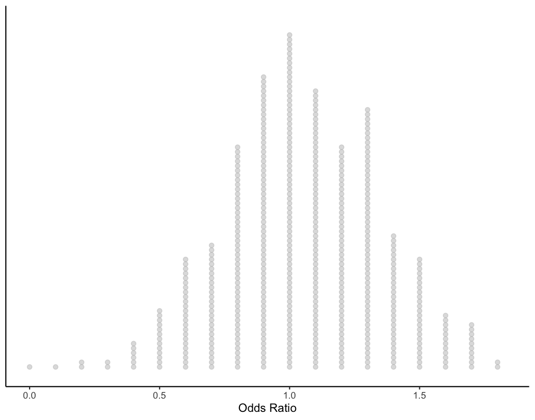
Alternatively, this histogram can be shown by plotting the individual odds ratios and stacking them. Showing the individual odds ratios will help us understand the TQIP boxplots later on.
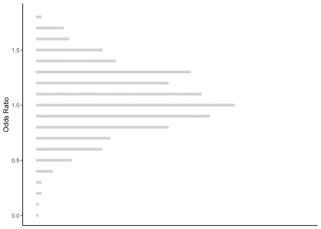
Again, to help us understand the TQIP boxplots, let’s flip this plot on its side.
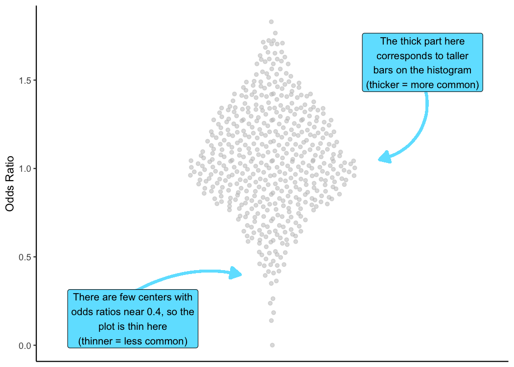
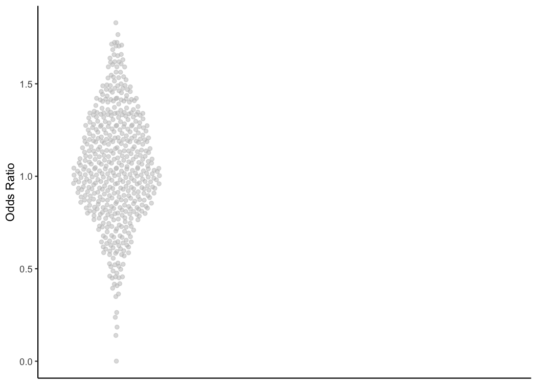
And let’s rearrange all those points so they are a little easier to see. In this next plot, the points are going to be centered along an invisible vertical line and mirrored on either edge of the invisible line.
Notice that the data haven’t changed at all. We’re only changing how the data are plotted.
And finally, we’re going to zoom out a little bit to give us some more room to work.
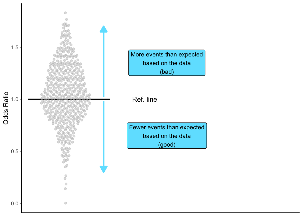
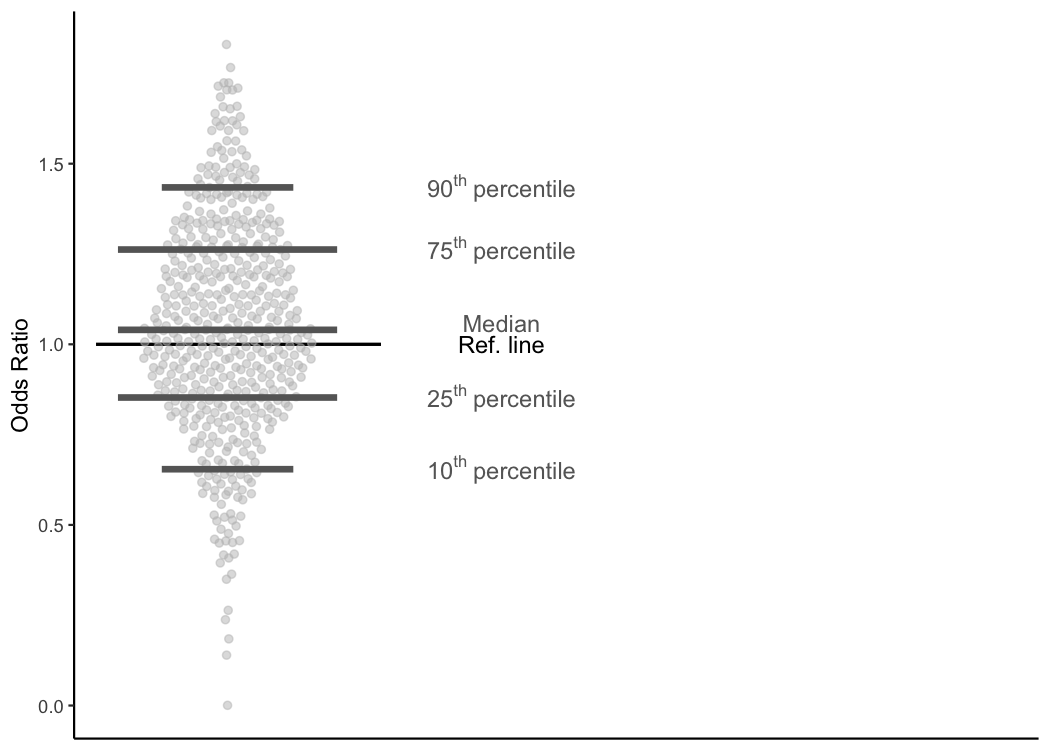
The reference line
As I mentioned before, when TQIP does its benchmark reports, it provides odds ratios (AKA observed to expected ratios), and an odds ratio of one means there were just as many events as there were predicted events.
Because of the importance of odds ratios in the benchmark report, TQIP
includes a horizontal reference line on its plots to mark an odds
ratio of one. TQIP’s plots also contain dotted lines at odds ratios of
0.5 and 2.0, but I’m not going to show those here.
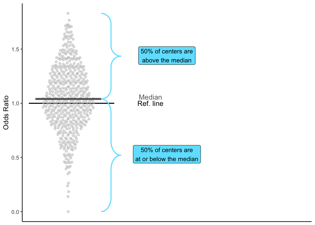
Median
In addition to giving information about the absolute value of your center’s odds ratio, TQIP provides a great deal of information about other centers’ odds ratios. The first piece of information TQIP provides about other centers is the median odds ratio.
The median odds ratio is the value at which half of all centers have
odds ratios that are less than or equal to it and half of all centers
have odds ratios greater than it. The median is also known as the
50th percentile since 50% of the data fall below the median
and 50% falls above it.
As you can see in this plot, the median is just a little bit greater than one (1.04 to be precise). So, 50% of centers had an odds ratio less than or equal to 1.04.
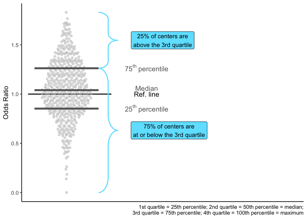
Quartiles
In addition to the median (or 50th percentile), TQIP also tells you about the 25th and the 75th percentiles. Just like the 50th percentile, the 25th percentile is simply the value at which 25% of trauma centers have odds ratios less than or equal to it. As a result, 75% of trauma centers have odds ratios greater than the 25th percentile.
As you may have guessed, the 75th percentile is the point at which 75% of trauma centers have odds ratios less than or equal to it, but only 25% of trauma centers have odds ratios greater than it.
Because a quarter of the data is less than or equal to the
25th percentile and a quarter of the data is greater than
the 75th percentile, these values are also known as
quartiles. Specifically, the 25th percentile is the first
quartile, and the 75th percentile is the third quartile. What
about the second quartile though? That’s the median!
The breakdown is that 25% of the data are at or below the first quartile; 50% of the data are at or below the second quartile; 75% of the data are at or below the third quartile; and the fourth quartile is just the maximum value so that 100% of the data is less than or equal to it.
10th and 90th percentiles
Briefly, TQIP also shows the 10th percentile (10% of centers have odds ratios less than or equal to this point) and the 90th percentile (90% of centers have odds ratios less than or equal to this point; 10% have odds ratios that are higher).
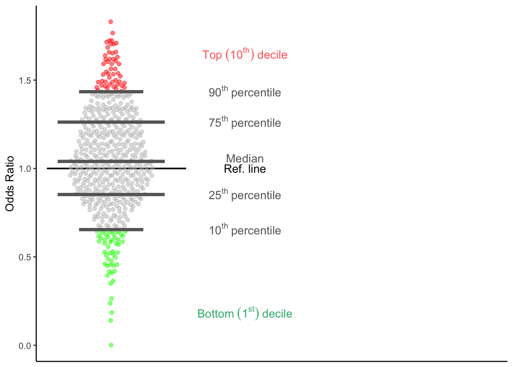
Top and bottom deciles
Just as quartiles divide the data into quarters, deciles divide the
data into tenths. So, trauma centers that are in the first decile (the
bottom decile) have odds ratios that are lower than 90% of TQIP trauma
centers. That is, their odds ratios are less than the 10th
percentile. These centers are shown with green dots in the plot. Even
though this is called the bottom decile, this is where the top
performing trauma centers are. Calling it the ‘bottom decile’ only
refers to the location on the page. Low percentiles and low deciles are
good things; that’s why they are shown in green.
Inversely, trauma centers that are in the tenth decile (the top decile) have odds ratios that are higher than 90% of TQIP trauma centers. That is, their odds ratios are greater than the 90th percentile. These centers are shown with red dots in the plot. This is where the lowest performing 10% of trauma centers are. High percentiles and high deciles are bad things; that’s why they are shown in red.
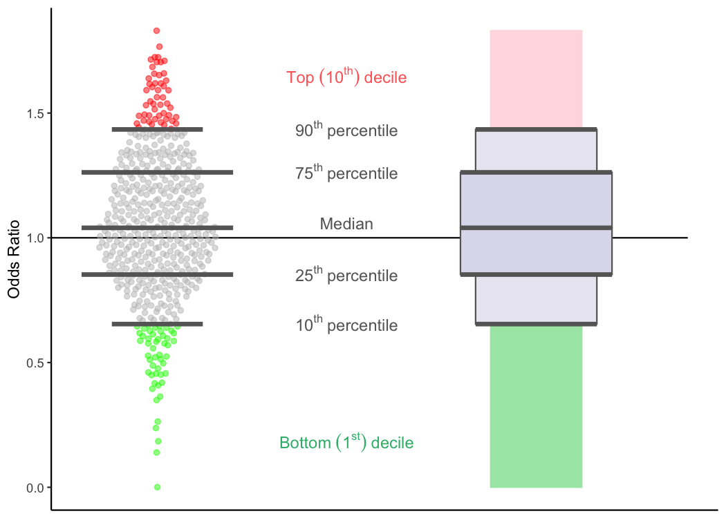
Putting it all together
Now that we’ve covered nearly all of the elements in a TQIP boxplot, lets bring it all together to see how the data/plot we’ve been looking at so far translates to TQIP’s boxplots.
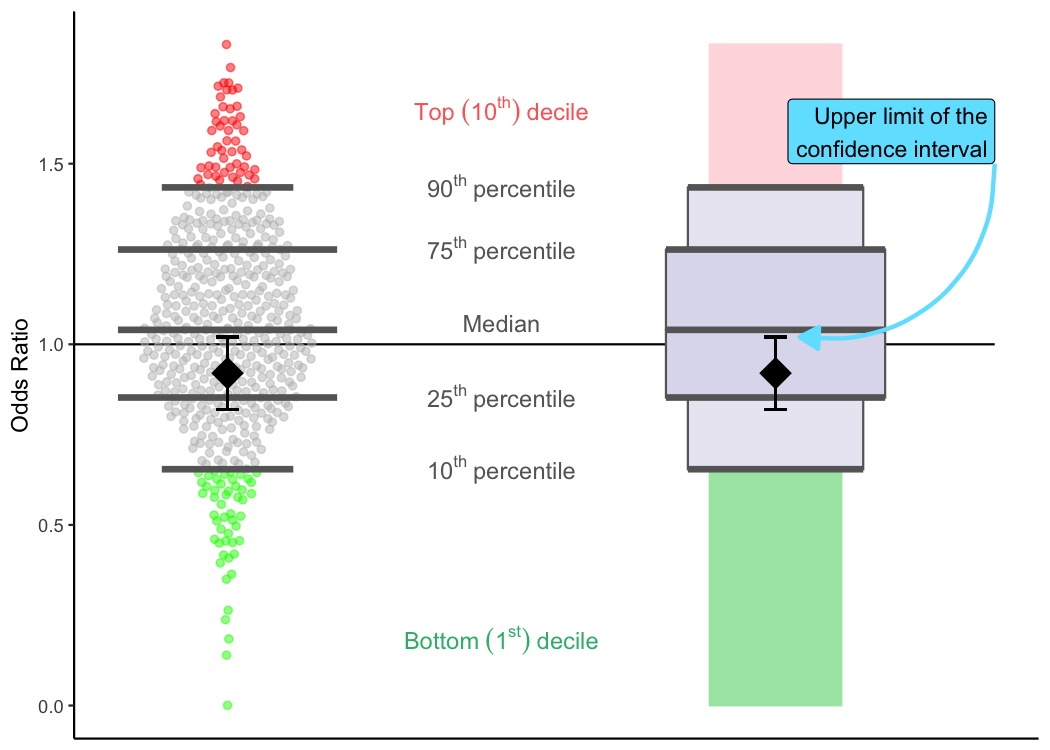
Confidence intervals
Just about the only part of TQIP’s plots we haven’t covered yet is your center’s specific odds ratio and the confidence interval that goes with it.
Since odds ratios were discussed above, I’m going to focus on the confidence intervals here. There is a lot of technical stuff that I could go into here (and maybe I will at another point), but I’m going to stick to what the confidence intervals mean for the TQIP benchmark reports.
While the odds ratios that TQIP provides in its benchmark reports are the single best estimate for how well your center is doing, that number is still only an estimate based on TQIP’s models. The “true” odds ratio for your center is something that can never really be known with absolute certainty. But with the help of some fancy math, TQIP can provide a range of likely values for your “true” odds ratio. This is where the confidence interval comes in.
The confidence interval tells you that—even though no one can know the
“true” odds ratio for your center—TQIP is confident that it falls within
the bounds of the confidence interval. (The exact amount of confidence
TQIP has will vary between reports and cohorts, so review the reference
materials that come with your benchmark report to see what degree of
confidence TQIP is using for each risk-adjusted metric.)
The confidence intervals are shown by vertical lines that stick out from the diamond-shaped odds ratio and then flatten out. The points where they flatten out into horizontal lines are the upper and lower limits of the confidence interval.
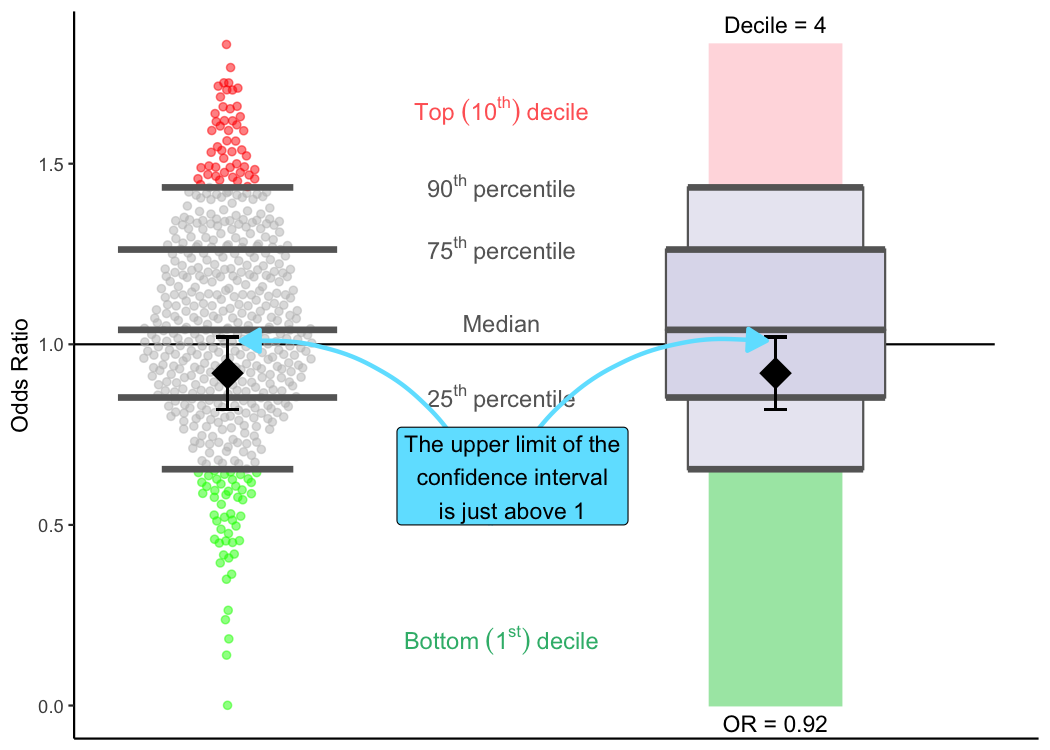
Average performers: scenario #1
The importance of confidence intervals to your benchmark reports is that as long as your confidence interval crosses the reference line in the plot (the confidence interval contains 1), TQIP can be reasonably confident that your center isn’t doing a lot better or a lot worse than would be expected by the data.
In that case, your center will be an average performer, which might look something like this. Here, we can see that this center is doing a little better than expected (odds ratio of 0.92; fourth decile). But, because the confidence interval crosses the reference line, TQIP wouldn’t classify the center as a high outlier or a low outlier, just an average performer. Therefore, the diamond for the odds ratio and the bars for the confidence interval are shown in black.
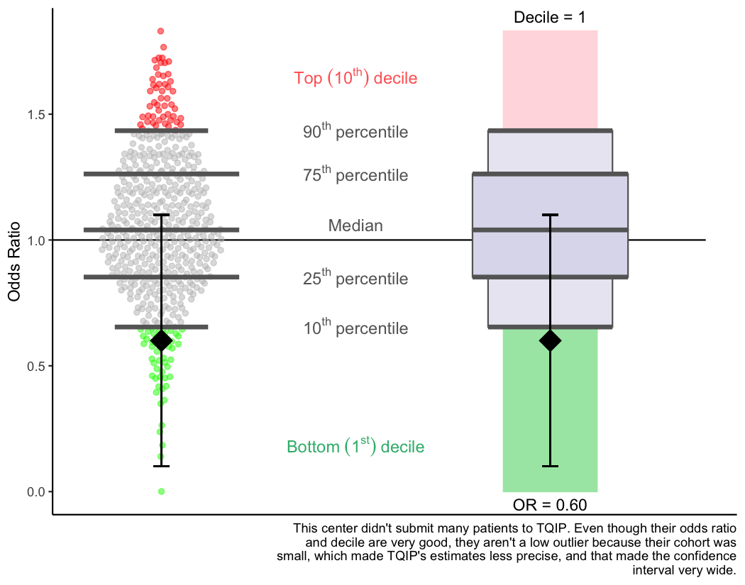
Average performers: scenario #2
Your odds ratio will always fall within your confidence interval. (If it doesn’t, contact TQIP because something has gone very wrong!) But the size of the confidence interval (how wide it is) will depend on a few factors. The main factor is simply how many of your patients were in the cohort in the plot.
This means that even though your center might be doing really well on some outcome according to the odds ratio and decile, if you don’t have many patients in the cohort, TQIP might not label your center as a low outlier. This is simply because the fewer patients you have in your data, the more uncertain TQIP’s estimates will be. And if your confidence interval crosses the reference line, your center is statistically indistinguishable from an average TQIP center.
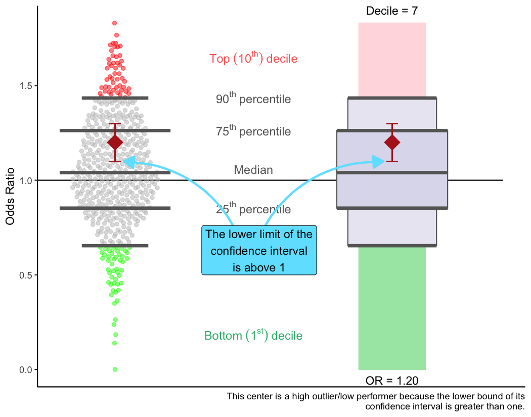
High outliers (low performers)
If the lower bound of your center’s confidence interval is greater than
one, TQIP will label your center as a high outlier. This means that
even after accounting for the uncertainty in the data, your center was
performing worse than expected based your data. This could mean you have
a quality of care issue, but it could also just mean that you have a
quality of data issue.
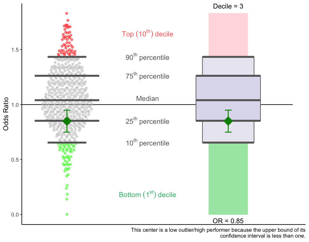
Low outliers (high performers)
Just as with high outliers, TQIP will let you know if you are a low outlier/high performer.
If the upper bound of your center’s confidence interval is less than
one, TQIP will label your center as a low outlier. This means that
even after accounting for the uncertainty in the data, your center was
performing better than expected based your data. This could mean you
provide exemplary quality of care…but it could also just mean that you
have a data quality issue.
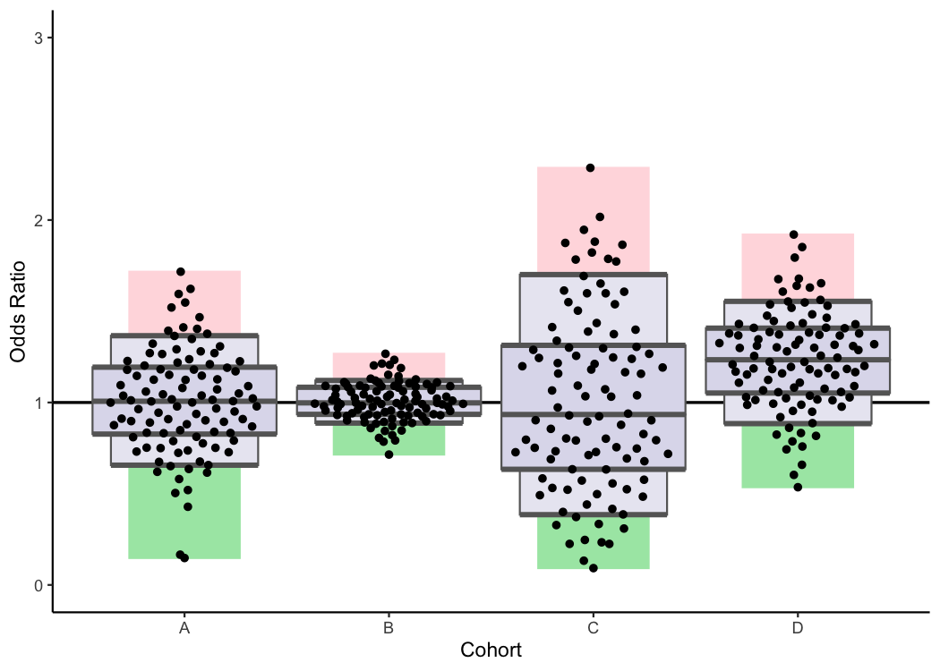
Why some plots have different shapes
Lastly, I’m going to discuss why it is that some cohorts have boxplots that are shaped differently from other cohorts. For example, in many of TQIP’s plots, you’ll likely notice that the boxplots for some cohorts are more scrunched up than other cohorts.
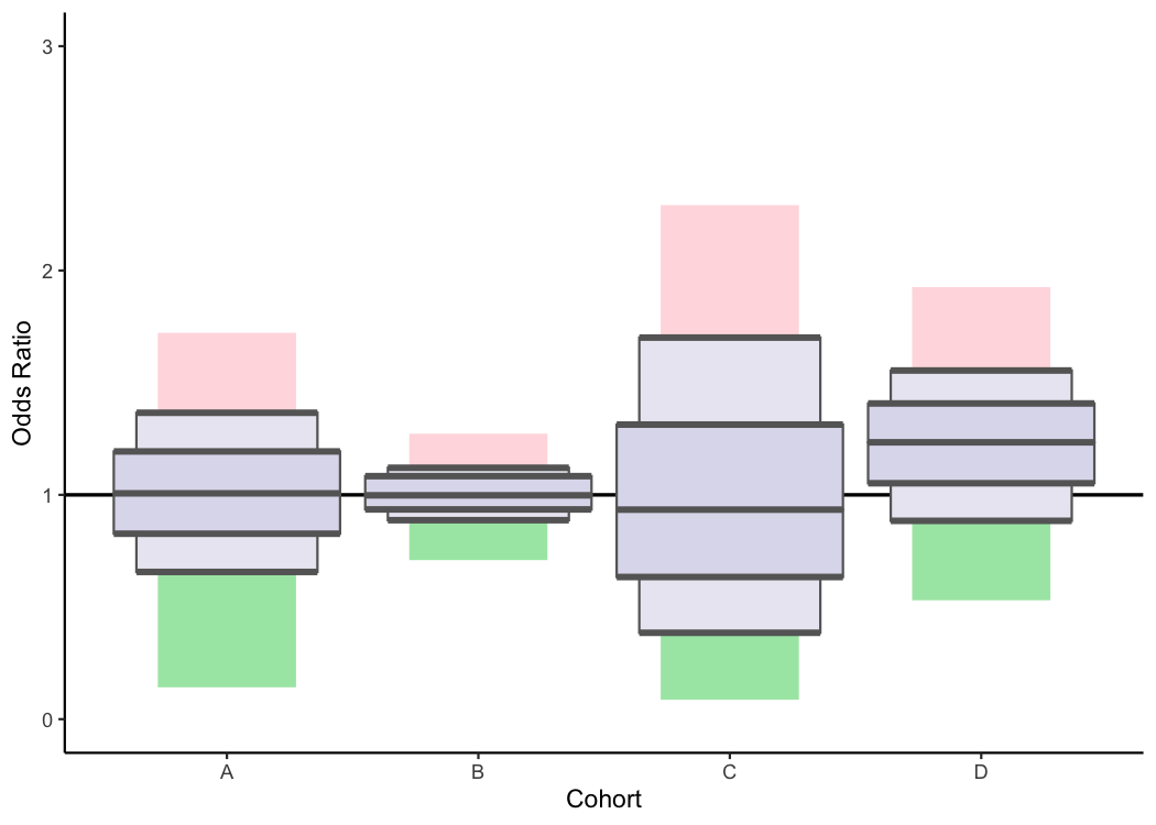
This can happen when the distribution of odds ratios differs between cohorts. In the above example, all the TQIP centers had odds ratios very close to 1 for Cohort B. Since all the centers were doing about as well as expected, the boxplot for that cohort is very tightly centered around the reference line (1.00). However, there was a lot more variability in the performance of centers when it came to Cohort C. As a result, the boxplot is much more spread out in that cohort.
Adding the dots for centers’ individual odds ratios back in can help make this more clear.
Conclusion
Hopefully this inaugural post on the Trauma Data Blog helped clear up a lot of questions you had about TQIP’s boxplots in the benchmark reports. If it didn’t or you still have questions, send me an email or leave a comment. I’d also love suggestions for future topics.
To see the code I used to create this post, click here.
Leave a comment
You can disable the adds below with Adblock Plus for your browser. Disqus is great for comments and feedback, but I had no idea it came with these awful ads.